Wednesday, April 6, 2011

Superhero - Every Hero's Dream

YESH my superhero visual effects video is finally done done DONE!


You might notice that there is one major change between my video and my storyboard - I had removed the bullet time freeze sequence! I had tried to implement that, but to do so, I need a clear tracking point. I tried tracking using both After Effects and Mocha but the tracking marks were just too poor (probably because the iPhone is thin and so when the camera rotates, the tracking mark is lost inevitably).

A solution I had thought of would be to paste a colored sticker (probably green so that it doesn't clash with the colors on my actor's shirt) on the tip of the iPhone with a black dot in the middle. But due to time constraints and the fact that I think I wouldn't be able to connect the gun shot sequences well.. I decided to just scrap it.

There is also some unsmooth jumps of the video......which I have absolutely NO IDEA why. I have checked my Premiere project files and my output settings are exactly the same as my source's.. both HD and 29.97 fps...... so I really have no idea why it still appears choppy.. it does makes me feel giddy. =( that would be the main disappointment in the video. I think it's because I used a Canon 500D to film it.. I'm not sure... T-T


But I think my biggest achievement in this video was that I managed to do the lightsaber sequence FRAME BY FRAME! O.O
I took about one and a half days just to do that.. also because I had to keep tweaking the positions as I had no reference to follow! In the tutorials that I had watched, they filmed with a lightsaber toy with the lightsaber rod attached (just that it's not turned on), so frame by frame becomes easier to do as they just have to move along with this rod as a reference. However, SINCE WHEN DOES AN IPHONE HAVE A LIGHTSABER ROD! I suppose I could have 'cheated' and used a real toy saber, but it would have been obvious. So it was just TONS OF GUESSING AND TWEAKING. But I think the final result turned out pretty ok.

And I think my actor (also my boyfriend) is also an awesome actor. I just love the last scene.. TOTALLY NATURAL!

Sunday, March 20, 2011

Special Effects vs Visual Effect

So this is where my lectures from CS4340 Digital Special Effects is going to come in handy. :)

What are "Special Effects"? What are "Visual Effects"? What are the differences?


Special Effects

Special effects and visual effects may create an illusion/effect to make the scene more convincing to audiences, but the workings behind both are different.

Special effects are effects that are created within the set, in the context of the actual live-action shot. According to Wikipedia, special effects have traditionally been categorized into two separate effects: on-set mechanical effects and in-camera optical effect.

On-set mechanical effects
Mechanical effects are created using mechanized props/scenery/scale models/pyrotechnic and atmospheric effects (creation of rain for example.. this reminds me of a time when I was touring South Korea with my family and saw a group people shooting a video with fake rain. They kinda like a big shower thingy and simulated rain!).

Examples (of the infinitely possible) include having doors that were 'engineered' to break during a fight scene, controlling a robot (off camera) so that the robot appears to be moving on its own etc.

Of the many breakthroughs in visual effects, the most noteworthy ones to me are Star Wars and Lord Of The Rings. For Star Wars, it was simply just out of the world (literally) at that specific era. And for Lord Of The Rings, the breakthrough came about most prominently in their use of perspectives to create the difference in sizes of the wizards and hobbits (will show an elaborate further).

Here are some videos to illustrate mechanical effects:


In this video, ILM (Lucasfilm's Industral Light & Magic) talks about how they created the character Jabba in the 1980s using a life-sized modela and people were controlling its expression. Obviously, such techniques will not be used in modern days anymore as we can easily generate CG models using computer software like Maya.
(P.S. A great resource to find out more about the special effects in Star Wars is: "From Star Wars to Jedi: The Making of a Saga". This video posted here is extracted from this resource)


This is about how the brilliant minds in LOTR achieved forced perspective.. and not just any simple forced perspective of how tourists do it by having their subjects stand and pose at a distance so that they like they're 'punching' the Eiffel Tower.. BUT FORCED PERSPECTIVE WHILE THE CAMERA IS MOVING! This is just incredible. Basically, how they achieve it is by having the characters at different positions and sliding them along while the camera moves so as to keep the forced perspective consistent!


Ok, this is just bizarre. We watched this video during a CS4340 class and we figured that they did this by having a large set that could actually rotate and have a camera fixed in the room (so it rotates together with the room). Pretty cool. We guessed that it's highly probable we're right because the actors always hesitate a while at the corners of the room which kind of suggests that they were waiting for the room to rotate till it's more stable for them to move on to the wall or ceiling.
And at about 3.02, it's quite obvious that the table is shaken manually (either by hand or by machines).


This is a very informative video of how to make a person look old. It's really cool!


In-camera optical effects

In Wikipedia, optical effects (also called photographic effects), are techniques in which images or film frames are created photographically, either "in-camera" using multiple exposure, mattes, or the Schüfftan process, or in post-production processes using an optical printer. An optical effect might be used to place actors or sets against a different background.

Here is an episode in Movie Magic (embedding is disabled): http://www.youtube.com/watch?v=GsSz5MZRNt0
One of the scene in this episode, it explains how compositing is achieved in a scene in Star Wars - whereby the characters are filmed with a blue/green screen and change the environment using an optical printer. This episode is mainly about the optical printer.


The famous bullet time technique pioneered in Matrix is achieved by using a row of cameras taking still shots and then fitting them together into the video so that they appear smooth. This shot, obviously, also has visual effects in them, which I will talk about next.


Back to Star Wars, here is a link that summarizes how the lightsaber shots are achieved: http://www.scientificpsychic.com/fun/
Basically, the lightsabers are rotoscoped in (i.e. painting over the film frame-by-frame, which can be done digitally now).


Visual Effects

Visual effects, or digital special effects (here's where it can get confusing), are effects that are generated by a computer, e.g. the robots in Transformers.

Visual effects (commonly shortened to Visual F/X or VFX) are the various processes by which imagery is created and/or manipulated outside the context of a live action shoot. Visual effects involve the integration of live-action footage and generated imagery to create environments which look realistic, but would be dangerous, costly, or simply impossible to capture on film. Visual effects using computer generated imagery (CGI) have become increasingly common in big-budget films, and have also recently become accessible to the amateur filmmaker with the introduction of affordable animation and compositing software.
- Wikipedia


Digital compositing, a term widely used in VFX, means digitally manipulating and integrating at least 2 images to produce a new image.


Ok, enough talk, more show! There is an abundant pool of examples which we can draw from, but here are just some.


How can we not mention the technology used in Avatar when we talk about VFX? It's the new frontier! James Cameron uses the technology of performance capturing with motion capture (mo-cap for short).


This is a breakdown of the VFX in Pirates of the Caribbean. There are also elements of using blue/green screen and then chroma-keying the screen out (i.e. remove the screen).


This is a pretty cool breakdown of a HP commercial. Basically, the effect is achieved by using a green screen to capture the person's head. Almost everything else, i.e. his clothes and the office environment are generated by CGI.


This is a breakdown shot of what somebody did (not in the movies).


This is a cool video of the more modern Star Wars.


What are the benefits and disadvantages?

The most obvious benefit is that it helps producers/directors achieve something in the film that they will not be able to shoot live in normal circumstances. However, the difficulty in this is the time and effort (plus careful observation) on making the effect look realistic and thus believable. Believability is the most important component in VFX these days, coz nobody's ever going to pay to watch a movie with lousy effects..they're just not going to be satisfied.

These special and visual effects help filmmakers cut costs in some sense because for example, they cannot possibly build an entire planet! If they are going to need tens of thousands of people to shoot a war scene, digital special effects can greatly cut costs too.

The disadvantage is that, as mentioned before, it takes a lot of skill for VFX to look good and these talent is quite expensive. If any thing in the effects breaks realism, it will not look good at all and will ruin the entire effect.

Saturday, March 19, 2011

My Kinetic Typography is done!


The back story to the song can be found here: http://en.wikipedia.org/wiki/Fast_Car

So basically, the song is a reflection of the original singer, Tracy Chapman's struggles with poverty. She describes how she was leaving her hometown with her boyfriend in a 'fast car' and how she thinks she can 'make it' and 'be someone'.

Hence, the typeface which I chose to accompany this song starts out clean - to reflect a hope. Thereafter, the typeface slowly degrades to a more distorted font (e.g. I used the font "Rock It" for the chorus), to reflect desperation.

This is my first attempt in kinetic typography and it was as enjoyable as much as it was a killer (I know, it's a paradox which I myself don't understand). I actually spent close to 3 days to figure out the mechanisms in After Effects, planning out the animation, executing them....... and then found out that I made a mistake in not "continuously rasterizing" them so everything became extremely pixelated.

But I generally am quite happy with the results. =D=D
I will overcome NM3208! Roar!

Wednesday, March 16, 2011

Tutorial for After Effects

Here is an online tutorial to help anyone who's lost to get started on their assignment. It also serves as a starting point for me haha:

http://www.crookedgremlins.com/09/01/2008/kinetic-typography-tutorial/

Tuesday, March 15, 2011

My Ken Burns Videos :)

I think Assignment 2 is my most chaotic assignment so far, because I simply just couldn't think of an interesting enough idea without being too cliche (you can see from my first video). And my ideas were just all over the place.


I was kind of disappointed with myself that even though I had spent a lot of time on this video, it wasn't something that I was proud of.

I HAD TO REDO IT! (to make my final semester in NUS worthwhile haha)

But after encouragement from Julian to just be sincere and honest about my time in NUS, and after getting inspiration from some the great photostories on Youtube, I decided to make my own photostory.

Ok, I didn't have the time to do a script for this. I just dived right in with the concepts already in my head.


My NUS Photostory


In this photostory, I talk about my grieves in programming. It was tough business here in School of Computing, with quite a steep learning curve. I could barely catch up in the beginning and my grades suffered as a result. I thought of giving up many times and even tried once to apply out of SoC and into FASS..maybe it's God's doing that my application was denied. In any case, I have learnt to appreciate NUS and SoC for giving me great opportunities to grow and learn, plus making friends along the way.

Monday, March 14, 2011

A3 Presentation

This is one of my favourite tunes recently.


Lyrics:

You got a fast car
I want a ticket to anywhere
Maybe we make a deal
Maybe together we can get somewhere

Anyplace is better
Starting from zero got nothing to lose
Maybe we'll make something
But me myself I got nothing to prove

You got a fast car
And I got a plan to get us out of here
I been working at the convenience store
Managed to save just a little bit of money
We won't have to drive too far
Just 'cross the border and into the city
You and I can both get jobs
And finally see what it means to be living

You see my old man's got a problem
He live with the bottle that's the way it is
He says his body's too old for working
I say his body's too young to look like his
My mama went off and left him
She wanted more from life than he could give
I said somebody's got to take care of him
So I quit school and that's what I did

You got a fast car
But is it fast enough so we can fly away
We gotta make a decision
We leave tonight or live and die this way

I remember we were driving driving in your car
The speed so fast I felt like I was drunk
City lights lay out before us
And your arm felt nice wrapped 'round my shoulder
And I had a feeling that I belonged
And I had a feeling I could be someone, be someone, be someone

You got a fast car
And we go cruising to entertain ourselves
You still ain't got a job
And I work in a market as a checkout girl
I know things will get better
You'll find work and I'll get promoted
We'll move out of the shelter
Buy a big house and live in the suburbs
You got a fast car
And I got a job that pays all our bills
You stay out drinking late at the bar
See more of your friends than you do of your kids
I'd always hoped for better
Thought maybe together you and me would find it
I got no plans I ain't going nowhere
So take your fast car and keep on driving

You got a fast car
But is it fast enough so you can fly away
You gotta make a decision
You leave tonight or live and die this way


-----------------------------------------------------------------------

I thought it'll be a rather cool song to use for this kinetic typography because I think I can use quite a lot of visuals to complement the lyrics. Besides, it's a pretty fast song (not in terms of the overall tempo, but the lyrics are sung in quarter/semiquarter notes).


I did a rough sketch for the first few verses of the song. For this assignment, I'll have to cut down the song to just the first two verses and the chorus.


Here's the rough sketch:

Thursday, March 3, 2011

PAL vs NTSC

This was mentioned during this week's lesson and I was kept wondering what is the difference between PAL and NTSC, because so often I'm stuck as to which format to use.

So anyway, I googled and found some results, which I thought I should share here.

Apparently, the basic difference is that the frame rates and scan lines are different, because in different regions, the engineering system is different. So.

Ok, so here are the links that might aid in better understanding:

http://www.ehow.com/about_5561488_pal-vs-ntsc.html

http://www.wisegeek.com/what-is-the-difference-between-ntsc-and-pal.htm

http://www.michaeldvd.com.au/articles/palvsntsc/palvsntsc.asp -- a lot more detailed!

Recording at RadioPulze lab!


This was my first time EVER at the RadioPulze lab! It's situated at the 'ulu-ness' of CDTL.. which was pretty cool actually - a part of NUS I've never been to.

The technician who helped was really really helpful and friendly (I forgot his name though). Very encouraging as well..which didn't make me nervous as I was recording.

Anyway it's pretty cool that the recording lab itself is like a mini hut within a larger studio. Lol! Cool cool!

And yes, without much need to explain, the quality of my recording was supppppeeeeeeerrrrr! No more recording at home! Anyway, I kinda had no choice since my GarageBand crashed on me..

Yeap! Are u looking forward to my Ken Burns assignment? Wakaka...

Tuesday, March 1, 2011

My A1 Website Is Up

Woohoo! My A1 website portfolio is finally up at my domain. All along I thought I had did something wrong in my forwarding (the things about forwarding domain/subdomains etc were really confusing).. but it turns out that I just typed my url wrong by missing out the "/A1/". So dumb right?
It's like calling the repairman to come down when our speakers aren't producing sounds but it's only because earphones are plugged in.. (it happened to my mom once!)

So, it's up here: carol-elizabeth.com

And here are some help regarding what it means to forward (for ultimate noobs like me):
- Forwarding
- What is a subdomain?

Tuesday, February 15, 2011

Assignment 2 Ken Burns Script

Note: I have yet again changed my idea for the Ken Burns assignment because I thought the earlier one was still too cheesy.

The link to my script is here.

Sunday, February 13, 2011

Presentation 3 (Scripting)

Select a minimum of 5 pages from each script and analyze them:
[In this blog post, I will be adding screenshots of the script to illustrate my observations of the scripts.]

1. Up

Being a major Pixar fan, I decided to focus this week's question on the animated feature film Up. I really liked how Pixar painted his story emotionally, artistically and visually.. so it was really a treat to be able to read this script.


The link to the script is here. (Up)

My focus will be from pages 1 to 10, the beginning part of the film.
I chose this portion because it's one of my favourite parts of the movie - the background story of the protagonist Carl.

Pages 1 to 10 of the script shows Carl's young interest (which was indeed his life-long interest!) in exploring and how he's a die hard fan of Charles Muntz. Carl also meets a girl named Ellie, also passionate about exploring, who enthusiastically befriended him..and unintentionally landing him in hospital.

The script ends just about the time when the film moves onward to the montage of how they got married and grew old together.

I was hoping to be able to obtain some clips from Youtube to compare between the script and the final product, but there wasn't any useful ones I could find, so.. I guess we'll have to make do without them. Go watch the DVD!

1. Which are the characters/roles in this script?
It is clear to see that the characters are usually given a bit of an introduction, and then highlighted just before their dialogue (i.e. the words they are supposed to speak). In notation, they are usually bold, capitalized and center-aligned.


1st character: Charles Muntz


Here, Muntz is described as a dashing young adventurer.
In here, the Newsreel Announcer isn't a character, but I think he has a role to play in the script, i.e. the voice over. Is there such a thing as a voice over character? Off screen character?


2nd character: Carl Fredrickson


Carl is also given a small introduction (about his age, so that the artists know how to design him) and then given a dialogue here.


3rd Character: Ellie

Ellie is given a more detailed description here.


Point out the voice over

Voice overs are noted using "(V.O.)" in this script.


O.S. stands for "Off Screen", which means that the voice belongs to a real character in the scene, and not just a narrator. The voice exists in the film's world and also IN THE SCENE, just that he/she has not appeared yet.


Point out the camera movement
I've looked through most of the script carefully and there isn't any camera movement for this script, sadly. But there are quite a few in Avatar, which I will talk about and show later.


Point out the transition
Denotes a "dissolve" or "crossfade" video transition.


These denote a "cut" to the next scene.

Usually, a change in scene happens when the surroundings are different, which can be seen in e.g. "EXT. SMALL TOWN NEIGHBOURHOOD STREET" and "INT. CHURCH - DAY", which I will explain in the next question.


How does it present place and time?

In these cases (and also throughout the script and most other scripts), INT. means an interior setting (or indoors) and EXT. means exterior (or outdoors).

Then, the exact place is specified, e.g. "Small Town Neighbourhood" or "Carl's Room".

Next, the time is specified, e.g. "Day" or "Night"

Of continuous, here's what I got off a website: some writers use "KITCHEN - CONTINUOUS" to emphasize the regular flow of time. But that's not necessary. Instead, CONTINUOUS is best used for stylized scenes where a conversation or action continues right across several Locations.


2. Avatar

The link to the script is here.

My focus of the analysis will be from pages 53 to 58.

Characters
Just like in the script for Up, the characters are center-aligned and highlighted in bold for their dialogue. Otherwise, they are presented in just caps in action/details paragraphs (i.e. non-dialogue).

Character: Tsu-Tey (Tribe warrior)

Character: Trudy (Military woman)

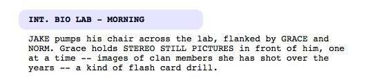
Characters: Jake (main character), Grace and Norm
In here, also note that their names appear in CAPS in the action/details paragraph.


Character: Neytiri (tribe princess) & Tsu-Tey

Character: Max


Characters: Jake, Colonel Quaritch and Selfridge


Voice Over
There aren't much voiceovers in these scenes.. In the movie, I think the only voiceovers occur when Jake was doing his video log. So this is just one of it.

The voiceover is denoted with a (V.O.).


Transition
The following snapshots show the video transitions. (consists of mostly Cuts)


Here, we have a Cut To the next scene.


A series of jump cuts - probably to drive home the point that Jake keeps falling and failing for many many times. This series of cuts also happen quickly (no pauses).


A cut to the next scene.
"OPS CENTER - NIGHT" refers to the place/time of the next scene.


Camera
Here are some camera angle notations in the script.

A wide aerial camera angle of the Samson among the floating islands. This wide angle shows the vastness of the place (although CG generated).


A tight shot of the horse's tendrils. A tight shot also refers to an extreme close up.


The camera focuses on Norm, a character.


The camera points at Jake, the main character.


Here, we have camera angles from Jake's point of view (POV) and the camera pointing at him.


A close up (CU) on Jake's Avatar.


The camera shooting at an angle on Max. Probably a high or low angle.
Together with a Cut transition to the next scene.


Place/Time
The following show the various place/time of the different scenes


Difference between scripts before production vs ready for production?

Well, I haven't been able to find a substantial answer online, but I guess upon observation of the scripts in IMSDB, I think that there is a difference.

Firstly, I noticed that the scripts in IMSDB are labelled with "Draft", "Shooting Script" etc. which I assumed that there are indeed different stages in script writing.

Ok, so just to zoom in and illustrate the differences using examples, I found Addams Family (shooting script..which I think would be the script that is ready for production) and Hancock (draft).

Well..... I guess the main difference between the two is that normally, in drafts, we don't find camera information (i.e. how to camera ought to behave when shooting etc..whether it's wide angle, or close up etc). Like in the previous question, the script for Up is also a draft and there isn't any camera information there.

I think the purpose of the draft would just be for the directors/producers etc to know how the story will unfold in detail. I suppose it also gives actors/crew to know roughly how the film is going to be like without too much details (kinda like the flavour of the movie). In fact, I think (just guessing) that before the actual shoot, actors come together to voice out their dialogues to see how they fit together and set the mood, hence they might be using the draft version for this case. Obviously, there won't be a need for the full script with camera info for this.

It will also be best to note that not all drafts in IMSDB are without camera info as in fact some do, e.g. Clash Of The Titans.

Thursday, February 10, 2011

Assignment 2 Update - Newest Idea

Ok, so right now after my previous failures in generating ideas for this assignment, I've come up with a new idea! It might sound just a little bit cliche...but I think it's more interesting than any of my previous ideas.

The title is gonna be:
"What Do You Want?"

Here's a rough script (I'll tighten it up and add some storyboards later):
  • "Do you wanna make friends? Enlarge your circle? Or find that special one?
    [show pics of friends, networking and romance!]

  • "Do you crave challenges? Seeking opportunities to get a taste of the outside world?"
    [show pics of internship]

  • "Do you want to have recreational time, doing things you love alongside academics?"
    [show pics of CCA, sports, etc]

  • "Do you like to excite your tongue? NUS offers a variety of cuisine and lowered prices so you get to enjoy good food without burning a big hole in your pocket!"
    [show pics of food]

  • "Are you a big fan of nature? Do you want to be in an environment surrounded by fresh air and greenery?"
    [show pics of nature around NUS]

  • [ending]
    "For academics, friends, activities and recreation, XXX people have chosen NUS. What about you?"

Wednesday, February 9, 2011

Assignment 2 Update

Apologies for not being able to have a detailed concept earlier on.. but I guess CNY's no excuse!

So anyway, the class decided that I should go ahead with idea #2, but maybe jazz it up a little.

Which I then thought of using a song, changing the lyrics for my script...
BUT BUT BUT
Julian said it's not possible!
I've already written out 85% of the lyrics....

T-T
Ok, this means I've really really gotta brainstorm for ideas........
Dear God, help me!

Tuesday, February 8, 2011

My Ken Burns (ideas) - in point form

I have 2 ideas:

1)
NUS "ROCK"
R - Rapport (Friends)
O - On the ball (mugging)
C - Cheap Food
K - Keep fit (climbing stairs, walking from block to block)


2)
My 4 years
(more honest!)

1st year - Orientation photos, CCA, STRESS, learning how to bid on CORS

2nd year - Decided to persevere, appreciate the food, explore more of NUS

3rd year - Make more friends, getting used to CORS

4th year - Getting the hang of modules, more project work, internship & GRADUATION!

Will probably end with a quote:
"Life in NUS may not be a bed of roses,
but I learnt through the thorns..."

Sunday, January 30, 2011

Week 2 Presentation - On Video Transitions

I.
http://www.youtube.com/watch?v=cULOFcZ93Ug
- Point out the part(s) that applies Ken Burns Effect.
- Which part(s) of using Ken Burn Effect you think are (is) good?
- Evaluate this video from other aspects (sound, photo, script, transition and so on). Which are (is) good and which can to be improved?


Map of NUS (0:10 - 0:12)
I think this is pretty ok given that the map already showed the cropped section of NUS FASS, however, the image moving from left to right makes it confusing because it felt like the audience was 'dropping of the edge'. It would have been better if the motion was zooming in instead.

Pics of stairs (0:20 - 0:26)
I like that the moving pictures of the stairs followed the shape/flow (if there is such a thing) of the stairs, e.g. going from bottom to top (cos that's how we climb the stairs from the bottom angle). There is also another zooming-out picture of the stairs and I think all these effects serves to slowly reveal just how many steps there are to take and gives the audience an element of surprise! I'm kind of picturing in my head that they'll go, "Wow, when are the stairs gonna end?... What there's still more?"

Looking up at a stairs (going up/zoom out) (0:27 - 0:34)
I liked that when the image of Cheryl looking up the stairs from behind was shown, the image was moving upwards because it would be like the natural way of looking at the stairs first from the bottom then upwards to see where it ends.
I felt that it was also appropriate for the image of Cheryl's face (the "not again!" part) to be zooming-out..I felt that it was effective in capturing her emotions at that point of time rather than zooming-in. I think it was because someone would imagine her screaming (imagine drawing lines from her mouth outwards to the edges of the screen..like a comic effect, if you know what I mean).

Food hankies (0:44 - 0:46)
I think there isn't any special meaning behind the Ken Burns effect, but I do think that the effect does give it a nice touch rather than just leaving it static.

Looking at books & mugging (0:58 - 1:08)
I think that the Ken Burns effect of the images of Cheryl looking at the pile of books and later on in her study materials was good because the motion followed the vision-line of her eyes.


Evaluation of the video.
I think that the script was done very well. It was interesting, engaging (her voice was very energetic) and definitely puts an honest testimony of what it's like to be a regular NUS student. I think the photos were done very well too (and the effort in taking them was commendable). Also, the concept of using people to hold onto the papers with letters was unique and interesting.
However, I think she can work on her laughter. At some points, her laughter/chuckle seemed very muffled and suppressed.. so it does sound 'forced' or 'fake to some extent. I think by relaxing and being confident of her voice/laughter would really help to improve the quality of the video, because it becomes something really personal and not staged.
You know what, I think she can probably even just remove the laughter bits altogether.


II.
What are the types of video transition?
- Please list 5 different video transition effects (see the Adobe Premiere menu). When should these transition effects be used? What are the meaning attached to each transition effect?
- Please find 5 clips which illustrate when these five effects are used, and their meaning/purpose [The meaning of the direction: From left to right [the good guy], from right to left [the bad guy], an example from tonight’s lecture]. If you cut the clips from your DVD, please put these clips in your A2 folder i.e., in addition to your answers you write in the blog. (tips: you can find videos from YouTube; you can also cut your own movies).


1. Cross dissolve
Meaning attached: Across a certain time span.
When should it be used: When trying to show different shots in which there is a time lapse in between them.
(5:17 - 5:22 from http://www.youtube.com/watch?v=VDlsGm59xHc&feature=related); the passing of time as Harry waits for his turn while the other contestants went for their turn.

2. Dip to black
Meaning attached: Across an even longer time span.
When should it be used: As in #1, but probably when there is a longer time lapse (e.g. a few hours or even days). It can also be used between different acts or scenes. A fade out draws more attention to the passing of time while dissolve does not.
(1:09 - 1:11 from http://vimeo.com/groups/stopmotion/videos/12155835); to signify a passage of time as the bottle flows to the other character.

(See: 1:09 - 1:11)

Bottle from Kirsten Lepore on Vimeo.


3. Push
Meaning attached: A change to a different scene.
When should it be used: When we want to change a scene creatively/to a different scene with a different setting or at a different time.
(0:37 - 0:42 from http://www.youtube.com/watch?v=KCyMT3eXs7c); used to change the scene into a flashback.

(See: 0:37 - 0:42)


4. Iris
Meaning attached: A round moving mask that can close down to end a scene (iris-out) or open to begin one (iris-in), which by doing so reveals more space in the scene (in iris-in) or focuses on one point while eliminating other details (in iris-out).
When should it be used: starting or ending a scene (with a particular focus point in the scene and eliminates other elements in the scene). (quoted from Yale Edu)
http://classes.yale.edu/film/videos/Iris-Neighbors.wmv

5. Additive dissolve
Meaning attached: There is sort of like a flash of light when this is used, probably to signify a 'magical' journey into the non-physical world (e.g. a memory, flashback, dream or some imaginary world).
When should it be used: Before going into a memory, flashback, dream or some imaginary world.
(3:36 - 3:40 from http://www.youtube.com/watch?v=fUYiRZ3kUCM) --> a flashback/history scene, and it also gives a mystical feel to it.

(See: 3:36 - 3:40)


III.
Define what are “pan, tilt‐up, tilt‐down, zoom, close up; extreme close‐up; wide‐angle; high‐angle; fisheye, and telephoto”
- Show us how to pan, tilt‐up, tilt‐down, zoom, close up; extreme close‐up; wide‐angle; high‐angle; fisheye, and telephoto
- Please discuss the suitability of using pan, tilt‐up, tilt‐down zoom, close up; extreme close‐up; wide‐angle; high‐angle; fisheye, and telephoto in the clips.
- What is the meaning/the purpose of pan, tilt‐up, tilt‐down zoom, close up; extreme close‐up; wide‐angle; high‐angle; fisheye, and telephoto?


Pan:
With pan, the camera turn to the left or right. It gives the movement that scans the space horizontally and it serves to connect the places/characters spacially (like how near or how far apart the subjects are). The speed of the pan can also be used for dramatic purposes, e.g. fast pans suggest that characters have no time to waste, giving a sense of urgency and perhaps danger.
(5:42 - 5:45 from http://www.youtube.com/watch?v=fUYiRZ3kUCM) --> adding to the illusion of speed of the vampires


(See: 5:42 - 5:45)


Tilt:
Like pan, just that the camera swivels up or down instead, scanning the space vertically. It is used sometimes to create a social difference between characters (the weaker ones, like slaves, are at shot from high-angle and the master is shot from low-angle). It is also a means of creating suspense, since viewers do not know when the camera will stop, or what will be found there (can also be said of pan).
(0:20 - from http://www.youtube.com/watch?v=XSIOopnk7L8) --> tilting down the skulls, and we don't know what we might find below.


Zoom:
The focal length of the lens changes as the shot is in progress, and it seems like we are moving towards or away from the subject.
Zooming in has a variety of purposes, e.g. focusing on a particular subject in a crowd, or creating tension if we zoom in too close. Zooming out helps to create an establishment of the subject's surroundings.

Close-up:
A framing which the subject takes up a lot of space in the screen. (the scale is large)

Extreme close-up:
A framing which the subject is shown even larger than close-up, and is usually used with human faces. This usually focuses on a particular facial feature, e.g. eyes/nose/mouth, and it gives a disturbing feeling for the viewers (like too close for comfort).

Wide-angle:
Short focal length lenses are used and it distorts the straight lines near the edges of the frame and by exaggerating the distance between foreground and background (the opposite of telephoto). More of the scene can enter the frame, so it is used usually when the scene is in an enclosed space.
(5:20 - 5:25 from http://www.youtube.com/watch?v=2JsDNfI9IDk&feature=related)

High-angle:
The camera shoots from above the subject and tilted downwards to frame the subject. It gives a feeling that the subject is weak.

Fisheye:
A distortion of the image (more distortion than wide-angle) and gives a very unnaturalistic shot. It is used sometimes in landscape shots and skating shots.

Telephoto:
The effect is to compress the depth of the image, so that the distance between the foreground and background (or something far away) is compressed.


Note: All the videos are not copyrighted by me and I just found them off the net. Please note also that some of the videos cannot be embedded here in this blog because the user who uploaded them disabled it.

Monday, January 24, 2011

My Own Domain Name

I've just bought my OWN domain name for the online portfolio!

http://www.carol-elizabeth.com!

Ok, so I've just only bought the DNS, not the web hosting. But still, the name is mine!

I thought it'd be better if the domain name was my own name (Elizabeth's my baptism name. It's an official name!) so that it's like a branding for myself. Besides, it's easier for people to remember.

Sunday, January 16, 2011

Week 1 Presentation

I.

Please list 3 good websites which you like and evaluate these websites. Do they apply the Principles of Visual Communications which you have learnt in NM2208 (Color Scheme, Layout, Gestalt and so on)? Do these websites use CSS? If yes, how do they implement the CSS across the websites? If no, why? What makes them good?

[Disclaimer]
It has been a long while since I took NM2208, hence the full and exact details of what was learnt is a little foggy, so please bear with me while I do my best to refresh my memory.


Apple

For my top pick, my FAVOURITE would be the Apple website. Okay granted, I may like to use Apple products, but I think that their website is really pleasing on the eyes and easy to navigate around.


Applying Principles of Visual Communication
  • Color Scheme: The colors are of a consistent grayish tone, so it is soothing to the eyes (I can't imagine if the colors are too bright and contrasting all the way) and it also gives it an elegant look.
  • Layout: The website is organized neatly into grids and the most important information (or at least what the company wants people to notice) is always placed at the center (e.g. new products). Plus, different sections of information are placed into boxes and the headings are often highlighted in a different shade, which makes the distinction even clearer.
  • Typography: I especially love the typography here as everything is consistent, readable and even the spacings between the letters make it look very pleasing.
  • Others: I like it that everything I want to find out about the products are very easy to find. Firstly, the navigation at the top is very clearcut - there is no ambiguity in it. I also like that there is a search option, so that in the event that people still cannot find what they are looking for, they can just use the search function.
Did the website use CSS?

Yes. After reading through some of the source code, CSS was done for the navigation bar and also for the display of text. The body text throughout the website has a consistent font and color and the hyperlinks also have its own color set. CSS was also used for the proper positioning of the elements (e.g. side bar, main content etc).


Crumpler

Next, it would be the Crumpler website.


Applying Principles of Visual Communication
  • Color: The theme of the website is that of a "real-life store", complete with shelves and table top for the cash register. I think that the website achieved this theme well with the color scheme - e.g. the main shelve area where the products are displayed has a white/plain background, which is mostly the case in stores so that the background will not distract the consumers from the product.
  • Gestalt: The products are placed across the website in a horizontal manner (albeit level by level). There might not be much of a practical explanation for this, but I guess it makes it more readable and neater for the people to read.
Did the website use CSS?

No, since the website was fully built in Flash. It is good, in my opinion, because it is very engaging in terms of the animation and the functionality of the website (displaying the price tags, sorting of the products according to type & price, having a search bar and even having a 'cash register' at the bottom of the page for us to keep track of the total cost). I also find that the theme of the website was very fun/unique/interesting and energetic, much like what the company actually wants to portray - the kind of fun, energetic, youthful and vibrant culture for the consumers.


Pixar

Finally, another website which I found to be good is the Pixar Animation Studios website.


Applying Principles of Visual Communication
  • Color Scheme: White was used as the background and much of the website's fitted the "white, clean and classy" look. For example, the navigation was just a plain white, which (to me) made it all the more clean. It wouldn't have been as effective if the background of the navigation bar wasn't white.
  • Layout/Gestalt: Everything was organized very neatly and very much simply - with just the navigation on top, main content in the middle and perhaps another sub content horizontal bar for additional interesting news (only in the homepage). It makes it very straightforward and easy to read.
  • Style: The style of the website can be said to be clean and minimalist - which is a style I very much appreciate if done well.
Did the website use CSS?

No, the website didn't use much CSS, except for perhaps some of the formatting of the text (which didn't take up much of the website because it was mostly constructed with images). The layout of the website was mostly done using HTML tables.
I guess the good thing about the website was that it was clean and concise - achieving its purpose of introducing the public of their projects and their company's history.


II.

What are the advantages of using CSS?

CSS makes it more manageable for the website designer to design the website (also for the webmaster etc) because the layout and text style are already done in css, so there is no need to keep on using the HTML tags for every single chunk of text - which also significantly reduces file size.

On further research to the topic of CSS, I found out that it makes loading of the page faster too as the browsers cache the stylesheet page (http://www.plus2net.com/html_tutorial/css-adv.php).

A disadvantage, however, would be that CSS may not work consistently in different browsers.


III.

What is Woff? What are the advantages of using Woff? Any disadvantages? Find 2 good websites which apply Woff. Elaborate how Woff is used in the websites.

Woff stands for Web Open Font Format. It is a font format for use in web pages (developed by Mozilla), whereby people design fonts, save or convert them to WOFF and then use other technologies (e.g. HTML, CSS) to tell browsers which fonts to download and apply.

For more info, check out Wikipedia here, and w3 here.

Advantages:
  • The font data is compressed, hence websites will use less bandwidth and loads faster.
  • More fonts can be available to designers since there are more licenses for WOFF formats.
  • It has the potential of becoming universal and an interoperable font format for the web (since it is gaining in popularity).
  • (more info visit here)
Disadvantages:

I suppose it would be problematic if the server which supplies the fonts goes down.

2 good websites:

So far, I haven't been able to really find good websites that employ Woff. However, I did manage to find some demo sites that employ Woff (although sad to say that I wasn't able to load some of the fonts in some websites).

Here they are:
demo1
demo2
demo3

Tuesday, January 11, 2011

Magical Me

The term "magical" came into my mind when I was thinking of the video effects that we'll need to be doing later on in the module (and was trying really hard to come up with a cool name for this module's blog). Then I just thought about Lucasfilm's Industrial, Light and Magic department that makes the special effects of movies, and I thought "Hey, MAGIC!"

It's quite a pretty apt term to describe NM3208, or even new media for that matter, because it's dynamic. People get to interact with one another on the web and get to see video effects that otherwise won't be able to achieve in the real physical world.


Oh, and the "ME" does not necessarily need to be about me. "Me" can also be short for "media".

Haha, smart right?

XD